
Mastering Typography and Color Theory: Elevating Your Designs on Canva
Mastering Typography and Color in Canva: A Comprehensive Guide for Impactful Design
This article may contain affiliate links. This means we may earn a small commission if you make a purchase, at no extra cost to you.
Typography and color are the foundation of effective visual communication. They shape how a viewer interprets a message, influence emotional response, and determine whether a design feels polished, cohesive, and memorable. Whether you’re creating brand assets, social media graphics, or marketing materials, understanding how to use typography and color effectively is essential.
This guide explores both theory and application, focusing on how to elevate your designs using Canva’s tools and resources.
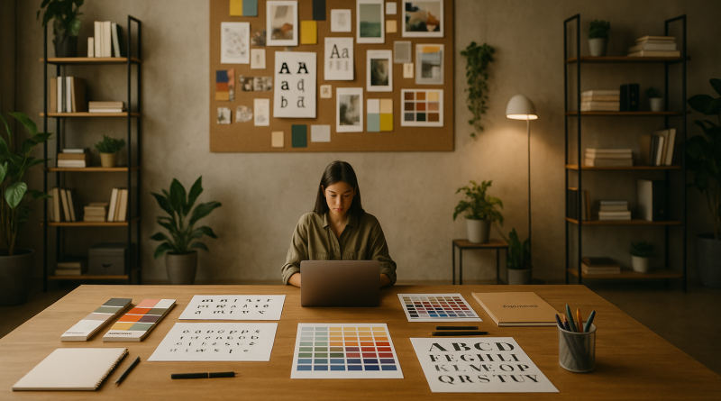
1. Understanding Typography: The Art of Visual Structure
Typography goes far beyond selecting a nice font. It’s the craft of arranging type to enhance readability, guide attention, and reinforce the message.
Key Typography Fundamentals
-
Type classifications:
Serif, sans-serif, slab serif, script, display, and more — each style communicates a different tone. -
Font anatomy:
Baselines, x-height, ascenders, descenders, kerning, and leading affect how type behaves visually. -
Hierarchy:
Create structure with clear levels of importance — headlines, subheads, and body text. -
Choosing the right fonts:
Match typeface personality with your design purpose (e.g., elegant, modern, bold, playful). -
Effective pairing:
Limit your design to 2–3 fonts that complement each other in contrast and style.
Typography sets the voice of your design — from professional and corporate to artistic and expressive.
2. Exploring Canva’s Font Library
Canva offers an extensive and diverse collection of fonts for virtually any design style.
What Canva’s library offers:
-
Classic serif and modern sans-serif fonts
-
Bold display fonts for attention-grabbing titles
-
Handwritten and script fonts for unique personality
-
Minimalist geometric typefaces for modern aesthetics
Best ways to navigate the library
-
Use search filters (e.g., “serif,” “bold,” “vintage”)
-
Create collections for consistent branding
-
Explore Canva Pro for premium, exclusive fonts
With so many options available, Canva makes it easy to build a typography style aligned with your brand identity.
3. Typography Techniques: Enhancing Readability and Style
Typography comes alive when arranged thoughtfully.
Advanced techniques available in Canva
-
Kerning: Adjust spacing between individual letters for balance
-
Tracking: Modify spacing across entire words or phrases
-
Leading: Control vertical spacing between lines of text
-
Alignment: Left, right, center, and justified text to match composition
-
Text effects: Shadows, outlines, curves, glows, and more
Building purposeful hierarchy
Use contrast in:
-
Font size
-
Weight
-
Color
-
Spacing
-
Placement
This ensures viewers naturally follow your design’s intended path.
4. Understanding Color Theory: The Psychology of Visual Impact
Color influences emotion, behavior, and attention. Whether subtle or bold, your color choices shape the viewer’s perception.
Core principles of color theory
-
Color harmony: Analogous, complementary, triadic, monochromatic combinations
-
Contrast: Ensures readability and creates visual tension
-
Symbolism: Cultural associations affect interpretation (e.g., blue for trust, red for urgency)
-
Psychology: Colors evoke emotional responses—calm, energy, luxury, excitement, sincerity
Mastering color helps you create designs that resonate on a deeper level.
5. Canva’s Color Tools: From Selection to Application
Canva includes intuitive tools to help you choose and manage colors effectively.
Key tools include:
-
Color palette generator: Create palettes from uploaded images
-
Color picker: Match colors from any element
-
Color combinations tool: Instantly build cohesive schemes
-
Custom palettes: Save branded palettes for consistent use
-
Brand Kit (Canva Pro): Store colors, fonts, and logos for unified identity
These tools ensure harmony and consistency across your projects.
6. Applying Typography and Color Theory in Real Projects
Understanding theory is one thing — applying it is where design truly comes to life.
Examples of real-world application
-
Branding: Use consistent typography and colors to establish recognition and trust
-
Social media graphics: Bold headline fonts + high-contrast color palettes = strong engagement
-
Marketing materials: Balanced, readable body text ensures clarity and professionalism
-
Presentations: Harmonized palettes and clean typographic hierarchy enhance comprehension
Good design supports the message — never distracts from it.
7. Advanced Techniques and Creative Exploration
Canva’s features allow for even deeper creative experimentation.
Advanced tips to level up your design:
-
Create custom gradients to add depth and dimension
-
Use layering to build visual hierarchy
-
Explore blending modes (e.g., multiply, overlay) for dynamic effects
-
Incorporate textures and patterns for richer designs
-
Mix typography styles thoughtfully to add personality without losing clarity
These techniques push your work beyond simple layouts into richly crafted visuals.
Conclusion
Typography and color are two of the most powerful tools in design. With a solid understanding of these principles—and the intuitive tools available in Canva—you can transform your projects from ordinary to visually remarkable.
Experiment boldly, refine consistently, and use Canva’s features to bring depth, emotion, and clarity to every design. With thoughtful use of typography and color theory, your creative possibilities are limitless.